
-I started writing this post with a big diatribe about the state of the 'men's style blogosphere,' but I'll save that for my next post, it's sort of a milestone... Anyway, our blog is getting more attention than it ever has, so I realized it was time to clean up the image a bit. More than just keeping up with the joneses, I realized that the blog, which is a clear extension of myself, ought to reflect my interest and skill in photography and design.
-It didn't take me very long to to come up with the concept for my new header. Any given day walking to school I may have to hike a muddy trail or hop over foot-deep puddles; One of my most basic sartorial tenets is to never use weather as an excuse to look like 'everybody else.' As I've said quite a few times, you'll never catch me in a Northface jacket (unless it's purple label.) So the idea of this photo illustration, which represents my daily stylistic navigation of the unforgiving Northwest climate, came to as soon as I'd decided I wanted to shoot a new lead image. I'm very satisfied with the way it turned out. Follow me after the jump for some behind the scenes shots, a couple of the rough drafts I did before deciding on this version, and a little more commentary about the inspiration for the header.
-A little splatter painting. Don't kid yourself, it took more than a few tries to get the right splat look right.
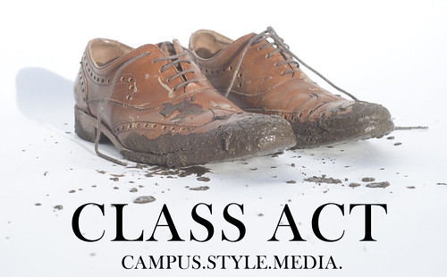
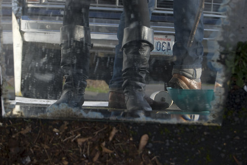
-An early version of what ended of as the final draft. Notice the prevalence of shadows, which is why at first I didn't want to use this image.
-
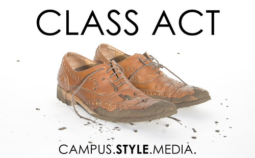
-Another version. Upon consulting with some people in whose opinions I trust, I decided against the sans serif font. Kind of an interesting choice given that my typographic and design knowledge is mainly in the realm of journalism/news/magazine design, which teaches that headlines should almost always be sans serif (because headlines in nature are big and easy to read, and body text should be serif, because serifs aid reading fluency by giving a visual cue to move on to the next letter.)
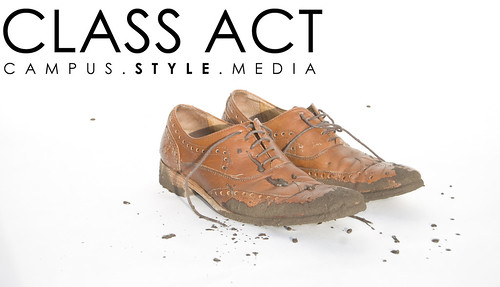
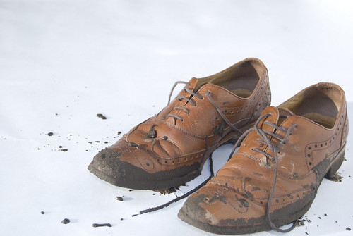
-This one looks more like a business card, which is probably my next design project anyway. I liked this image a lot though, the shoes look more lonely.
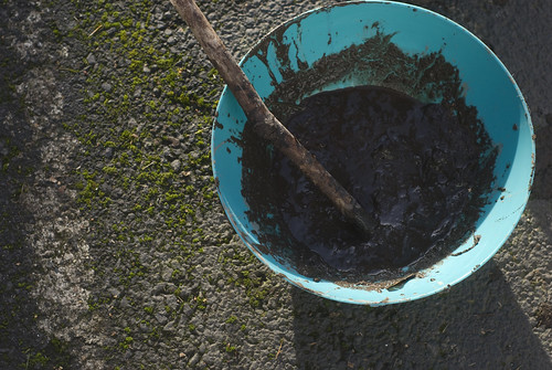
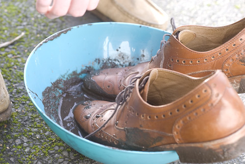
-My bowl of homemade Pacific Northwest Mud.
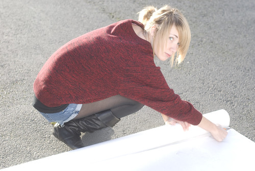
-As with 99% of Class Act content, I couldn't have done shoot effectively without the creative and actual support of my beautiful girlfriend Grace. You should follow her on Twitter.
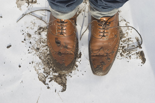
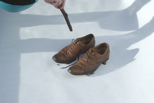
-Top-view. My original intention was to shoot the shoes with me in them, I realized while shooting that dealing with the shadows (we don't have lighting gear, we're poor) would be too much of a hastle, and shooting the shoes by themselves would lend to a cleaner image.

-The denim looks good though.
-Dippin in some mud. We shot about 100 frames all together.
-Hit up our Flickr for even more photos from the shoot. Be well and keep checking back, good things are coming from Class Act in 2010.
Tuesday, January 19, 2010
Campus Construction: An Eyefive Facelift
Subscribe to:
Post Comments (Atom)
11 comments:
well-done. quite brave to muddy up those shoes!
Gracias. The shoes are mad cheap so I don't mind getting dirty if there's a creative goal at hand.
Nice. I like the "behind the scenes" info to. In the process of switching things up on my site to so I might have to do a similar feature.
naked and famous?
Yeah naked and famous the 12 oz
a behind the scenes view? gotta love it
looking good man...
a lo what kinda shoes are those? glad to see your blog is gettin so much more exposure
MFG! theyre dkny, get up here we need to have a business meeting.
baller
i think you idea for your header is great.it represents your campus style great!thumbs up from berlin
Post a Comment