Sunday, January 31, 2010

Dress Code: The Non-Initial Monogram

-The badassity of monogramming is undeniable: Adding a bit of personality to your favorite items is almost always a good move. But I carry enough ego with my style as it is, I don't need to adorn everything with my initials. So, in my very small monogram collection, I've opted for a different route. Option 1 (top) I chose to rock the initials of a loved one/significant other. Only consider this option if said loved one/significant other isn't likely to be out of your life before the garment is. The shirt is a Rugby make-your-own oxford, it fits great and was only like $65 I think. Rugby has also taken the J.Crew route and started granting a 15% discount to college students.
-Option 2 (bottom) I chose to use an acronym from a personal motto. Don't ask me what it is, but it has to do with being a badass. The shorts are J.Crew. Think about getting your shorts monogrammed, it's a nice change of pace from the more-common sweater/polo mongrams. J. Crew offers monogramming on a lot of their items for $10 if you're shopping online, so the next time you're grabbing a plain crew neck sweater, think about throwing some initials on there. Just remember, you don't absolutely have to go with your own initials, your choice could be as simple as a set of letters that just roll off the tongue. I'm trying to have a large collection of monogrammed gear, and I'm trying not to let any of them have the same three letters, that way each is special in its own way. more

Thursday, January 28, 2010

Professors: J.D. Salinger


-J.D. Salinger passed today at the age of 91. I just wanted to throw this post up quickly to honor Salinger, whose words influenced my young literary mind immensely. Inarguably one the most influential American authors of all-time, Salinger's understated style mimicked his prose in its ability to say so much with very little. more

School Supplies: Sonic Lab


-My pursuit for a quality big-kid backpack is never ending. I've posted about potential packs too many times to even link back to, just search backpacks in the search bar if you're interested. Also, my inclination toward military and military inspired gear is well-documented. So when I saw the Sonic Lab bags over at Mister Crew I was intrigued.  I already own a military-inspired duffel, but this backpack could be just what I'm looking for. My only worry is that it might be slightly too large for daily use, but I mix up my bag choice depending on what I have to carry everyday. I'm also not completely into the branding (if you look closely everything is printed) but the backpack looks to have minimal text.
-The bags are priced fairly well ($175 for the backpack) but they are, as expected, only available via Japanese outlets as of now. I'm probably one of the last style bloggers to have not attempted making a purchase from Japanese retail via proxy. It would actually be easier and cheaper for me just to have someone who knows Japanese order for me then to use a proxy, so we'll see what happens.
-Photos from Uneven blog and Mister Crew more

Wednesday, January 27, 2010

Design Major: Iceberg Fall 2010


-Fashion week has been over for a few days but I wanted to post this one last set of looks from Iceberg. The past two Iceberg collections were two of my favorite showings of the past couple years. This particular collection didn't rank as high on my scale as the past two, but the brand is at least showing up consistently, which is more than can be said for a lot of wishwashy labels. Iceberg is a little more youthful and casual than a lot of the lines showing, but there's no reason the casual youth can't rock exquisitely cut jackets and waistcoats. There's nothing wrong with having an eye for what people are actually wearing on the street, as long as the product is well-made. As in the past shows, the cardigan usage was great here.
-Hat's don't ever really do it for me, and this show was no exception, but I dug the flower brooches. That buffalo plaid jacket is boss status. I've yet to actually see Iceberg in stores though... more

Monday, January 25, 2010

Dress Code: D.S. Dundee Assembled by Class Act


-British label D.S. Dundee just came to my attention via Sartorially Inclined's ENK coverage, and I found myself mystified that I hadn't discovered this brand sooner. With all this emphasis on outdoor gear in the states, I'm more drawn to Britain, where hunting and general ruggedness has been stylishly refined for generations. There's not really much else to say in addition to the looks. All of the items I selected were on sale except for the jeans. I didn't notice that the Camel Jacket picture included the same striped sweater until after I'd pulled both of them, but I added the colorful shirt for a pop of color out of the collar that would tie the sweater and jacket together. Dundee doesn't have ties on their web site, but I'm told they have a neckwear line, or I'd have obviously included those in my looks. more

Sunday, January 24, 2010

Dress Code: Class Act's Favorite Accessory

tie bar collection, need more
-Some time during my senior year of high school, 05-06, I bought a super rad vintage sterling silver tie bar at Ray's Ragtime in Portland. It had no adornments or ornamentation. It was just a clean, slightly worn rectangle of silver, and I loved it. Sometime during my freshman year of college, 06-07, I lost said tie bar during a night that involved some combination of a snow, alcohol and police. Since then I have mourned, and longed for a replacement.
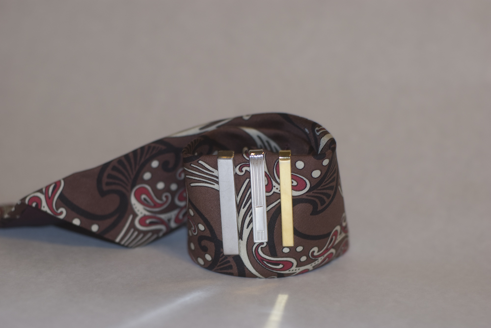
-A couple months ago I walked into a new antique store in Bellingham called Etta's Attic. Upon inquiring with the owner (presumably Etta) about tie bars, she told me the only one she had at the moment was the goldish piece above. I bought a jar and she gave me the goldish (I'm not sure of the metal) one for free. She also took my name and number and told me she'd call me if any silver tie bars came her way. About a week ago I got the call and returned to Etta's Attic. She hooked me up with the two silver tie clips (apparently if it clips, it's a clip and if it slides, it's a bar. Doesn't make any difference to how they look when in use) shown in the picture for a great price.

-Although I originally thought I could only get down with an unscathed surface, I'm really digging the etched clip I got. But I'm still not satisfied because, although both those pick-ups were great, I want one like my first: A plain silver bar, not clip.
-A few times I've debated just biting the bullet and buying a new bar rather than hunting for a vintage piece. J.Crew and Tiffany (left, and right below) both have a sterling silver tie bar for $75 (so on principle I'd have to get the Tiffany right?) But I think I'm going to just wait it out until I find the perfect one (again.) I told Etta what I'm looking for so hopefully something comes her way before I'm outta here next spring.

-I realized that I've just gone on about how I want more tie bars, but I didn't say anything about why. It's a bit hard to articulate why the bar has become my favorite accessory (even though the accessory itself is dependent on another accessory, the tie.) Maybe it's because I've never been too big on jewelry that the idea of working some metal into a look, but not right on my skin, is appealing. Whatever the logic, I like how a very simple bar can set focus a crazy patterned tie, or a patterned bar can make a very plain tie pop a bit.
-Oh and if you don't know the rule on tie bar placement, it should be as low as it can be while still remaining visible when the highest button of your jacket is fastened.
-For more interesting tie bar analysis check out Momentum of Failure. Also, I apologize for this wack image, shooting tie bars was hard because they're so damn reflective!
more

Friday, January 22, 2010

Senior Year: Class Act 600 Posts Later


-600 posts isn't any sort of landmark, there's no real benchmarks in blogging, but it's a nice round number that gave me a chance to think about what the blog has meant to me. If you're a fan of Class Act, or have any interest in my feelings on two years of blogging, then follow this link (my jump function isn't currently working) to read a long, rambly post. If that doesn't interest you, check back tomorrow for a post about vintage tie bars. more

Tuesday, January 19, 2010

Campus Construction: An Eyefive Facelift


-I started writing this post with a big diatribe about the state of the 'men's style blogosphere,' but I'll save that for my next post, it's sort of a milestone... Anyway, our blog is getting more attention than it ever has, so I realized it was time to clean up the image a bit. More than just keeping up with the joneses, I realized that the blog, which is a clear extension of myself, ought to reflect my interest and skill in photography and design.
-It didn't take me very long to to come up with the concept for my new header. Any given day walking to school I may have to hike a muddy trail or hop over foot-deep puddles; One of my most basic sartorial tenets is to never use weather as an excuse to look like 'everybody else.' As I've said quite a few times, you'll never catch me in a Northface jacket (unless it's purple label.) So the idea of this photo illustration, which represents my daily stylistic navigation of the unforgiving Northwest climate, came to as soon as I'd decided I wanted to shoot a new lead image. I'm very satisfied with the way it turned out. Follow me after the jump for some behind the scenes shots, a couple of the rough drafts I did before deciding on this version, and a little more commentary about the inspiration for the header.


-A little splatter painting. Don't kid yourself, it took more than a few tries to get the right splat look right.
the process
-An early version of what ended of as the final draft. Notice the prevalence of shadows, which is why at first I didn't want to use this image.
rough draft
-

-Another version. Upon consulting with some people in whose opinions I trust, I decided against the sans serif font. Kind of an interesting choice given that my typographic and design knowledge is mainly in the realm of journalism/news/magazine design, which teaches that headlines should almost always be sans serif (because headlines in nature are big and easy to read, and body text should be serif, because serifs aid reading fluency by giving a visual cue to move on to the next letter.)

-This one looks more like a business card, which is probably my next design project anyway. I liked this image a lot though, the shoes look more lonely.
mixing mud
-My bowl of homemade Pacific Northwest Mud.
DSC_0748-12
-As with 99% of Class Act content, I couldn't have done shoot effectively without the creative and actual support of my beautiful girlfriend Grace. You should follow her on Twitter.
DSC_0738-11
-Top-view. My original intention was to shoot the shoes with me in them, I realized while shooting that dealing with the shadows (we don't have lighting gear, we're poor) would be too much of a hastle, and shooting the shoes by themselves would lend to a cleaner image.
DSC_0732-10
-The denim looks good though.
DSC_0709-6
-Dippin in some mud. We shot about 100 frames all together.
DSC_0696-2

-Hit up our Flickr for even more photos from the shoot. Be well and keep checking back, good things are coming from Class Act in 2010.
more