
-I started writing this post with a big diatribe about the state of the 'men's style blogosphere,' but I'll save that for my next post, it's sort of a milestone... Anyway, our blog is getting more attention than it ever has, so I realized it was time to clean up the image a bit. More than just keeping up with the joneses, I realized that the blog, which is a clear extension of myself, ought to reflect my interest and skill in photography and design.
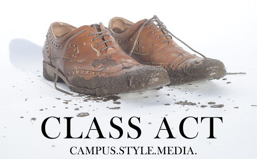
-It didn't take me very long to to come up with the concept for my new header. Any given day walking to school I may have to hike a muddy trail or hop over foot-deep puddles; One of my most basic sartorial tenets is to never use weather as an excuse to look like 'everybody else.' As I've said quite a few times, you'll never catch me in a Northface jacket (unless it's purple label.) So the idea of this photo illustration, which represents my daily stylistic navigation of the unforgiving Northwest climate, came to as soon as I'd decided I wanted to shoot a new lead image. I'm very satisfied with the way it turned out. Follow me after the jump for some behind the scenes shots, a couple of the rough drafts I did before deciding on this version, and a little more commentary about the inspiration for the header.
-A little splatter painting. Don't kid yourself, it took more than a few tries to get the right splat look right.
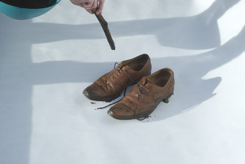
-An early version of what ended of as the final draft. Notice the prevalence of shadows, which is why at first I didn't want to use this image.
-
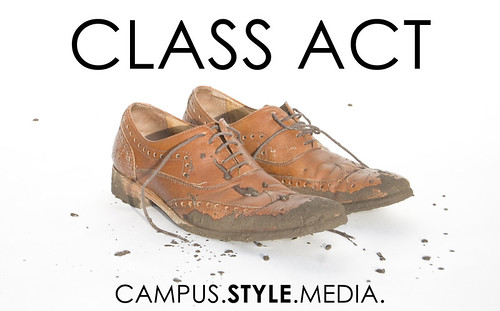
-Another version. Upon consulting with some people in whose opinions I trust, I decided against the sans serif font. Kind of an interesting choice given that my typographic and design knowledge is mainly in the realm of journalism/news/magazine design, which teaches that headlines should almost always be sans serif (because headlines in nature are big and easy to read, and body text should be serif, because serifs aid reading fluency by giving a visual cue to move on to the next letter.)
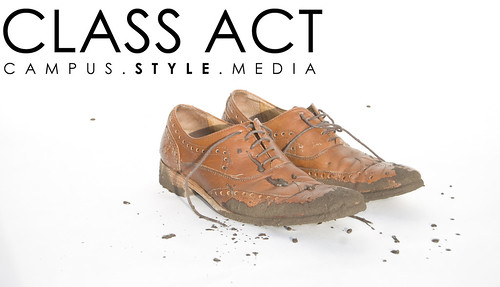
-This one looks more like a business card, which is probably my next design project anyway. I liked this image a lot though, the shoes look more lonely.

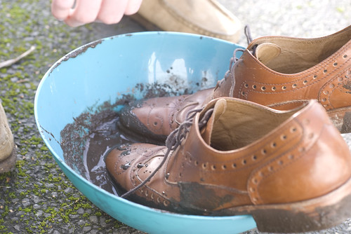
-My bowl of homemade Pacific Northwest Mud.
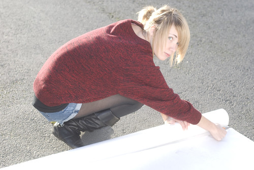
-As with 99% of Class Act content, I couldn't have done shoot effectively without the creative and actual support of my beautiful girlfriend Grace. You should follow her on Twitter.

-Top-view. My original intention was to shoot the shoes with me in them, I realized while shooting that dealing with the shadows (we don't have lighting gear, we're poor) would be too much of a hastle, and shooting the shoes by themselves would lend to a cleaner image.

-The denim looks good though.
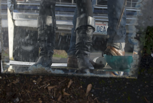
-Dippin in some mud. We shot about 100 frames all together.
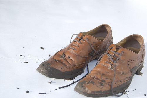
-Hit up our Flickr for even more photos from the shoot. Be well and keep checking back, good things are coming from Class Act in 2010.
more
Tuesday, January 19, 2010
Campus Construction: An Eyefive Facelift


Monday, January 18, 2010
Design Major: Trussardi 1911 Fall 2010

-I don't want to be preemptive, but I think Trussardi 1911 might be my favorite Milan collection. I've been following the label since they re-launched a couple years ago, and my feelings have been mixed. The last two collections had some inspiring looks, but they were far less succinct than this offering. This is one of the most spot-on collections I've seen from anyone in a long time. The Fairisle-ish patterns in red, white and black add just enough Italian flair to the mix. After seeing this I'm really going to be on the hunt for some exquisitely tailored light-grey wool trousers (I'd look into getting these ones if I wasn't sure they were out of my price range.) This collection shows their versatility, almost like jeans, they can work with a plaid and vest in a more outdoorsy look or they can clean up in a more traditional suited look. The last image shows a look I could easily recreate with things that are already in my closet (except for the sneakers, I don't do high-top.) Anyway, I'm having trouble expressing why (the phrase that comes to me is unpretentious luxury,) but for me this collection was the definition of 'killed it'. I have a feeling some people may disagree with me, share your thoughts.
more
Design Major: C.P. Company Fall 2010

-If you read my previous post, then you might find it interesting that the first collection I really liked is the one that looks the most in-line with the American trends right now. The trousers tucked into boots (which I thought were Redwings at first glance) and the toggle coats are all big right now. What I liked about the C.P. Company (a brand I'm admittedly ignorant about) collection is that they worked in some fantastic color into the heavy layers. I'm already thinking about how I could use some soft, dark purple in my normal military/outdoor influenced looks. The field jacket in the middle image is my favorite piece from the collection. Usually we see field jackets as a heavier top layer, but this one is nicely fitted almost like a shirt-jacket, definitely something I could get down with. Share your thoughts in the comments. more
Sunday, January 17, 2010
Dress Code: A Class Act/E5S Fashion Week Primer

-So that said, I will continue for as long as this blog exists to comment on fashion week collections. I only post looks that I like, I'm never really looking to critique things I don't like: My job is to find what appeals to me, not second-guess what appeals to the particular designer. Doing this is mainly for me. It's to try to find inspiration in new collections, not just about which new things I'd like to buy, but about how I could use the things I already own and love in a new way. With so much emphasis on history in American style right now, it's interesting that people are turning their backs on the Italian and British fashion houses that are steeped in so much seminal menswear history. Referencing and recreating history is always important in fashion, but we also need the visionaries to imagine how style might resonate in the future — which is an idea that I think is lamentably absent in the current American scene. more
Friday, January 15, 2010
School Supplies: Heritage Research Wilderness Parka

Wednesday, January 13, 2010
Professors: Woodrow Wilson

-Editor's note: I also read somewhere that Wilson was a very adamant racist, which is something we are certainly not trying to celebrate, so please don't take this promotion of Wilson's dapper tastes as a promotion of racism.


-Another note, this one not relating to Woodrow Wilson: Moved this week into a bigger apartment, which is why posts lagged this week. But the new space has much more room for my photo gear/product shots/self shots which is all good for Class Act, so stay tuned for some good stuff coming in the next few weeks, including a new page header. more
Friday, January 8, 2010
In-Class Presentation: The Loose-Tie Lesson Plan
In-Class Presentation: The Loose-Tie Lesson Plan from angelo spagnolo on Vimeo.
-I share a lot of photos of myself wearing my tie a little bit loose. The loose tie helps me give a nod to rebel Ivy style and helps maintain my boyish charm, so I go with it probably 3 days out of the week. I wanted to make this video though to ensure my readers that, while I promote a loose tie under certain circumstances, you won't ever catch me looking like a Jersey Shore reject with a cheap satin tie tied in a huge knot hanging 6 inches below an unbottoned spread collar.
more
Wednesday, January 6, 2010
Dress Code: The Light Rain Uniform

Subscribe to:
Posts (Atom)